31 December 2022

The Titanic, and the year-end clearance sale of old ideas


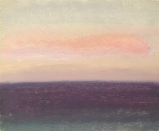
Evening Prayer Brunswick heads, 15 December 2022, oil on canvas board, 30 X 25 cm


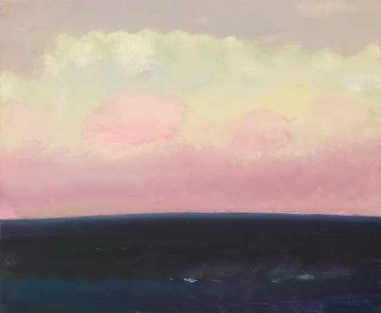
Evening Prayer Brunswick heads, 28 December 2022, oil on canvas board, 30 X 25 cm

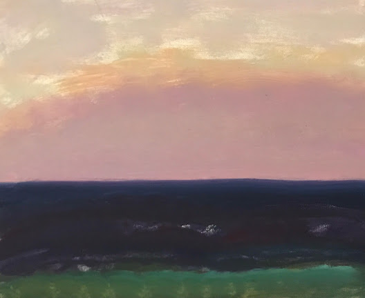
Here are two parting images to finish off the year 2022 which has been good to me in terms of creativity. 

The first study is from two weeks ago but the second one came at the very end of the session just the other night after I had cleaned my brushes and was about to clean the palette. But I kept looking up at the sky and seeing something so interesting that I thought I needed to try another, even a quick one; Grab it, and throw it down on the hard rubber mat like they do in Fake Wrestling, or so I imagined, that I imagined at the moment.

The sky had lightened as it will often do after the sun has shot its last rays high up into the back of the sky from the West, and it brightened briefly before descending into the dark night. And having seen this effect so often it almost always makes me think of the Titanic, which towards its final end, went down bow first and leaving the stern to rise up out of the ocean at almost 90 degrees into the starry night air before breaking off, then collapsing back into the black icy waters of the Atlantic. 

(Well,,, enfin.....I guess you had to be there) 

So I rapidly made this study and left it in its current fragile state as a souvenir. I long to be able to get there quicker, more efficiently, and with more ability for each of these studies.

And because it is New Year's Eve, a date where regret seems to seep into our thoughts, and where they too, will turn into tears of champagne and spill out of us. But painters should always dream of tomorrow regardless, because one can always wish that they had learned so much about both Life and Painting so much earlier in their lives. It's a natural regret but not one worth lingering upon because in the future, as we know, anything can happen. And isn't it about clearing out today's ideas to be ready for tomorrow's?  N'est-ce pas?

I wish everyone in these small pages a healthy and creative New Year 2023.


25 December 2022

and so this is Christmas...


         Vittore Carpaccio, The Flight into Egypt

Here is the most wonderful Christmas song anywhere

Thank you John Lennon

So this is Christmas
And what have you done?
Another year over
And a new one just begun

And so this is Christmas
I hope you have fun
The near and the dear one
The old and the young

A very merry Christmas
And a happy New Year
Let's hope it's a good one
Without any fear

And so this is Christmas
For weak and for strong
For rich and the poor ones
The world is so wrong

And so happy Christmas
For black and for white
For yellow and red ones
Let's stop all the fight

A very merry Christmas
And a happy New Year
Let's hope it's a good one
Without any fear

And so this is Christmas
And what have we done?
Another year over
And a new one just begun

Ans so this is Christmas
I hope you have fun
The near and the dear one
The old and the young

A very merry Christmas
And a happy New Year
Let's hope it's a good one
Without any fear

War is over over
If you want it
War is over

Now


22 December 2022

When palettes are fresh like salads each day,


As a painter, when working outdoors, I need to make up a palette of colours each time I work. I cannot say that every other painter does this because we all have different ways of working especially away from one's studio. Other painters will often make up larger quantities at a time or just use tubes or jars chosen from the vast array of premixed colours offered in today's market. 

When working outdoors, I myself, use a very limited palette. It consists of just two blues; Ultramarine and Prussian blue; a rich Magenta Red, Lemon Yellow concentrate, a Cadmium Yellow medium, and Titanium White. With these colours I can pompously say that I could reproduce almost any colour needed. And like a funky-looking witch at midnight I make my own 'black' when needed by using Prussian Blue and other 'secretive ingredients' that cannot be revealed to ordinary civilians (I took an oath). But one secret I did learn many, many years ago came from Cezanne, who though he used black and white on the same palette, would mix both of them in infinitesimal amounts to each of his other colours to help ensure an overall harmony in his pictures. He mixed such tiny amounts to every colour it would be hardly perceptible to the naked eye, but when spread across a French landscape they would absolutely radiate.

Because I set up a spontaneous palette for each session, I tend to limit colours to conform to a simple aesthetic idea drawn from a particular sky and similar to the key signature of a musical score which also loosely cements an idea.

Like an intimate Jazz trio weaving around an old Standard through various keys, there is also an improvised order to a painting palette similar to the main key signature anchoring the musicians enough to freely play in relative harmony. And equally, on the palette, primary colours are mixed to create tertiary ones which usually guarantee an overall harmony once they are all evenly mixed together. Like the royal families of 18th century Europe, political unity was achieved everywhere by the wise intermarriage of their offspring. The same is true of a palette.

But as well, one's palette is extremely personal, it is about as personal and original as a line drawing by just about anyone, and it should be. I know a few painters who have copied their masters's palette, and even after a lifetime of working, they have stayed loyal to it. I don't really understand this myself, but hey! I have another friend who has been painting for sixty years and has never varied any of his colours. I expressed astonishment when he told me this one day a few years back. But in the Painting World, everyone has to follow their own way because, man รต man, Painting is hard thing to do most of the time. And to be fair, I work so small that this improvised procedure can work for me, but to work larger is another ballgame altogether, with far more pitfalls.

Below, is one of Delacroix's palettes which may not reveal much due to its old age but it's a relic of beauty nonetheless, and concerning it, he wrote in his journal at one point:

"My freshly arranged palette, brilliant with contrasting colours, is enough to fire my enthusiasm". 

Maybe,.... but there was a rumour circulating at the time that he took his palette to bed with him at night and though this might be just the vindictive gossip of a scorned lover, it does raise the possibility that his fire was misplaced.


I imagine that Picasso used palettes at the beginning of his career but I have only ever seen photos of him mixing his colours on white porcelain plates which filled up his voluminous homes and where he appeared to paint in nearly every room, prodigiously so.

Over the last five years my palette has evolved only slightly but not too much. It has less colours now and it's shape is larger, just a piece of shiny cut formica glued to a piece of wood because as they say, more real estate is always better. It's heavier than a hand-held one but I don't hold it, it rests on the open tray of the easel when its set up.  

Below are some examples of different palettes on different days and over different years. I used to take photos of them from time to time when they looked interesting but I've since gotten out of the habit. Too often, I will forget my phone. Some show the colours at the beginning while others show them at the end of the session. 

At the bottom, I throw in some cleanly washed aprons (important!) and studies of the surgical gloves which can sometimes be quite sexy too.

(addendum, a few people have told me I should just show these instead of my paintings) (!)


Ladies Watch Out! Jack the Ripper is about!


19 December 2022

pictures are worth a thousand words, but context is everything


in Qatar last night


in Ukraine this week


                     and the magnificent stadium 


09 December 2022

Henry James on the Madness of Art and that darn G word!


Evening Prayer Brunswick Heads, 20 November 2022, oil on canvas board, 30 X 25 cm

It's a somewhat rare occurrence, but sometimes when I am finishing a study I can see that it's just perfect in every simple kind of way I could have wished. It's particular because it doesn't happen so often, and it always seems to come as a surprise. This quality of the moment,  this moment of 'suchness', as I've heard it described by so many Buddhists and other wise guys from the East. It pinpoints the perfectly to that extraordinarily mundane moment

But that doesn't mean that the picture came easily or that it lacked all those pernicious little choices that make up the creation of a painting. And yet, sometimes a painting surprises its author and comes out un-expectantly better than one could have hoped. I imagine young mothers might feel this after a long and hard labor.

I am not even sure I know what I mean by all that except that I am touching upon 'the inexpressible act of creation', a place where ones's personal willpower or ego has been left at the bench over on the sidelines, where the artist has been kidnapped, seized even by the capricious but benevolent hand of a drunken thief sent by God.

This above study was not laboured at all despite my confusions, it came quickly and it was done in about fifteen minutes. The sky had been an uncertain one, painfully ambiguous, meaning that I really wasn't guided easily into it or out of it. I would even say that it was a leap of faith, as it so often is with creativity. Somehow, I knew I would be lucky enough to find a pathway through it by sheer habit of routine. And I did, for the picture came out as a surprise. 

Ofttimes in this Painting life, the sky can lead me astray and distracted like little Red Riding Hood but I do eventually find my way to Gramma's home. But this night was a little different and the sky felt like the diffident girl at a dance, standoffish and aloof as I approached her. She gave no sign of approval but I asked her to dance anyway. This sky was like her. 

At the beach, feeling a little uncertain I mixed a palette anyway and proceeded because that's what I have learned to do. And what with so many recent rainy days I had really wanted to have painting session at the beach. I was randy and some might say. But at the beginning of the picture I felt like an intruder, locked outside the front door as I had felt in front of the girl at the dance so many years ago. But then the painting came, and I did finally get to dance.

For me, and others I'm sure, it seems that I am present when I'm most absent because when I am most completely engaged in something I really love doing I seem to be elsewhere. It happens while playing tennis, piano and and while painting these days, the rest of the time I am an anxious rabbit.

Everyone in front of any creative task has confirmed this curious space; writers, musicians, athletes, car mechanics, neurosurgeons and even stone masons in Venice, for the empty space of absentminded-focus is the place where magic happens. Why did it take me so long to figure this out?

But this marvellous state of quiet being cannot happen all the time as we all know. In between, we must fail lots, over and over it seems. In fact, that is the entry fee one has pay in order to become an artist, craftsman, or anybody of worth in this lifetime. 

The Zen wise guys call this space the 'Beginner Mind', the 'in between thought' before one acts while the Ancient Greeks called it 'The Muses'. the invisible angels who guides us, push us, allowing us to accomplish the task at hand despite our human selves. The 'Muses' drive the motorcycles, we just get on for the ride. 

I know that everyone has felt this from time to time, Thank God, we do feel it at times. (There! you see, I have used the G word after all,,,, after I had promised myself I wouldn't go near it!)

“We work in the dark, we do what we can, we give what we have, our doubt is our passion, and passion is our task — the rest is the madness of art.”

Henry James


02 December 2022

Hmmm,,, The artist's sartorial guide to the World Cup


OK, I am not really a football or soccer fan but please don't read anything into this because I love top notch sports, and my phone seems to understand this because they send me short video clips of the best moments that lead to a goal in all sports be it Ice Hockey, American Football, Soccer, or Tennis. And (b.t.w.) I played all these sports when in school.

So, The World Cup has no real meaning for me except for these little video 'tiktok' best moments on the phone. And yet I do see online photos of the players in various movements of play and I confess that being, ever the aesthete, I am secretly a closet admirer of team uniforms and am always on the lookout for the ones that visually turn me on. I have decided to dive into which World Cup uniform is the best kit, the one most pleasing in every visual way.

(B.T.W.) While looking for photos on Google I see that I am not the only one with a penchant for great-looking uniforms, The Sydney Morning Herald did an article the other week on the best and worst while also informing me that the whole 'get-up' is actually referred to as 'the Kit'. 

And, lastly, let's be honest, because the fans have become so, how can I say it(?), so truly awful in too many sports, one should really just stay at home and watch sporting events on a large television set. It's more comfortable and the food is free. Nonetheless.... here are my sartorial observations. At the very bottom of this long screed I have picked a winner!


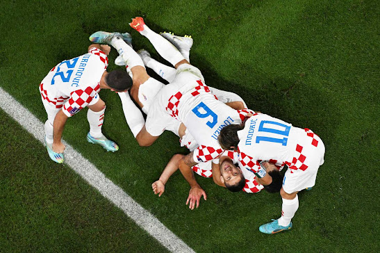
Croatia, not bad

a cool asymmetrical  design that obviously photographs with class.


South Korea not bad either, love it with the shoes

Japan's blue and white colour scheme, Oh Hum.... but OK up closer, Spain, lots of possibilities if they had only added another light colour somewhere to break that beautiful warm deep red.

Germany's kit: Ouch! If Donald Trump owned a soccer club this would be the uniform. 

Brazil, pretty cool colour harmony, and great font!

Celebrating Qatar's first goal over Senegal. These guys are just jumping for joy in deep earthy coloured tone of red. Nice!

Conservative chic, France scoring against Denmark. Don't think they need the gold,,,, too Emirates Airline! But they're a nice deep blue and deep red though.

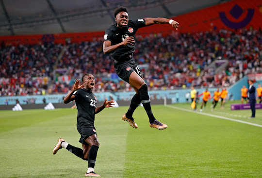
A player for Canada in its black 'kit' celebrates his first goal against Croatia. This guy is a meter in the air! And the black uniform looks super cool on black players.

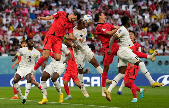
South Korea in the smashing red and clashing into the austere white of the Ghana team

Gotta love the sisters from Ghana!

great colour in this shot!

From Brazil, a light and lively colour harmony of blue violet lemon yellow and fluo Veronese  green details. Impressive against the earthy bright Spanish Red 'kit'

A protester runs out on the field looking pretty cool! He's protesting Qatar's misogynist, homophobic culture, so Good on Ya, as they say here in Oz.


Interesting uniform from Portugal, something about it doesn't quite work, the design does nothing for the colours. The design would be really cool if broken up somehow, but it seems heavy though, like the designer drank too much red Spanish wine.

I love the simplicity of this 'kit' from the team Senegal, celebrating a goal. White 'kits' on black players always look great but then Black athletes look great in every colour it  seems.

The Dutch! Always in orange like some weird elongated sort of fruit, I would have spiced it up with a fluo orange somewhere, or added a small dash of light Prussian blue, but hey! It works, and these guys are long time champions.


England's blue and white has a nice feel to it. The bold Ultramarine bleeds into a cooler Prussian Blue. Nice!


USA's all blue uniform is great, unusually so because USA teams, generally go in for all those awful striped red, white and blue logos which look tacky cheap and scream of the American flag! But here, it's pretty discreet thankfully. Iran's white is just OK, but because we love the Iranian people, especially given their present circumstances, I give it big nod, and it gets plus sign nonetheless. 


Alas! I love Australia where I live but I've never liked the green and yellow national colours. They alway look drab, a bit daggy. If either of these colours were spiked up with a touch of some fluo somewhere, they would certainly work better. (And I could do it for them! for free!)

Here with a Danish opponent who looks better in every which way.  A contemporary kind of pas de deux like in an opera by Robert Wilson.

Simple red over white for Tunisia while France (behind) in a deadly deep Midnight Blue colour scheme.


Beautiful Argentina kit! Much prefer it to their more habitual striped light blue and white which looks old school. I love the Ultramarine with highlights of subtle warm violet And here, it's even more impressive when seen in a group. This reminds me of the Emirates Airlines's hostesses who, when they move through an airport, are instructed to always move in a 'pod' as a group to ensure full impact, and it always does.

Mexico's bright zinger red stripes over perfect green, Yes! (and great teeth too!) Saudi Arabia's kit though discreet white with green details, nice number fonts too. It feels boring but hey! At least it's not Gold and Black!  

Canada in all Cadmium Red without any razzmatazz....OK.... but Morocco's discreet red and green over white works great, I like it!

Women Referees for the first time in a World Cup! Gotta love that! But those uniforms!! YUK!! Tut Tut!! Looks very German.

And so,,,,,in third place is the protester in a Superman KIT and rainbow flag.

In second place is Team Argentina in their solid blue violet kit

But in first place, it has to be Mexico! 

My aesthetic is my own, of course, and not having a National Team preference, I am free  without bias. But then,,,, it is my contest after all.... so there! 

I love the design and colour harmony of this Mexican team. It's a perfect soft Sienese red and hard Arezzo green combination. It's very painterly and very cool with its Florentine  colour harmony. How could it not work? And though I have never been to Mexico, but yearn to go sometime soon, and how can one not but love the Mexican people! They appear to be the happiest, kindest, and most joyful people on earth. And they are also hard-working migrants so fuck Trump anyway!